Step By Step
When I am asked to do a portrait, quite often after seeing the finished piece I am asked how I did it. So I've taken some pictures of the process I go through to complete a portrait. This only pertains to working with Graphite and isn't step by step the same every time, but you'll get the idea.
The next images are just visual aids so that those who are not fimiliar with art materials will understand what I'm talking about. I'm not trying to endorse particular brands.
In order as pictured; I use a heavy drawing paper (around 70 lbs, with minimal tooth [texture of paper]), drawing pencils ranging from 4H (hard) to 8B (soft), blending stumps or tortillions (different sizes), a kneaded eraser, a white polymer 'click' eraser, and a sheet or two of tissue (not the kind with lotion!). Also using thin cotton gloves helps keep the oils from your hands off the paper or just a clean piece of paper to rest your hand on when working detail areas.


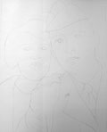
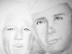
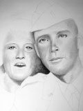
Sketch out the outline and harder edges. Don't draw in every detail as the more lines you put on the paper, the more you'll have to erase or run the risk of leaving a hard line when actually it's just a gradual blend, i.e. the nose.
Your goal should be to achieve a range from the white of the paper to the darkest possible stroke from the 8B pencil. In saying this, the only place on the image that is white will probably be the highlights in the eyes or light reflecting off jewelry. So I start out giving everything a dusting of graphite using the tissue, and in areas I know have deeper darks, I give a little extra emphasis.
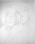
With a shaded base, I use the largest blending stomp and start working the darker shaded areas. If you are using a new tortillion, there won't be any graphite built up on it so you will need to lay down some shading with a pencil in these areas.
I usually concetrate on the face(s), leaving hair, clothes and background until later. I continue adding darker shading to the areas that require it and thus blending carries over to the lighter areas. Satisfied with the progress of the face, I move to the eyes. To start the eyes, I simply use the blending stomp again to rough in shape and contrast. In my opinion if you can get the eyes right, then the rest looks right too.
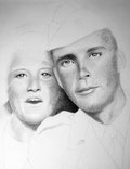
This step is a good example of getting good blacks or really dark shading in your picture. It's easy to get lulled into thinking the your shaded areas are dark enough, when actually they are probably in the middle of the range between white and black. The eyes again, are the only place on the face where you should have the darkest mark from an 8B pencil and that is the pupil.
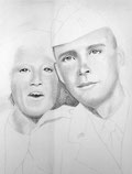
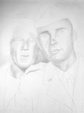
After you put a little work into the eyes, the whole picture begins to take on life. The eyes aren't 100% done but far enough that I've decided that I need to deeped the shadowed areas around the face(s) some more. Nostrals, mouth, and under the chin are primary areas to darken up quite a bit. I think it's better to darken in steps instead of all at once, just so long as you keep in mind that it does need to be darker and not leave it after one pass with the pencil and blending stomp.
I keep going over the picture with the pencil and blending stump, the more of a contrast (difference between light and dark) you can achieve the more 'pop' the picture will have.
Don't be tempted to use your finger to blend the graphite. Besides getting your hands and fingers coated with graphite and probably putting smudges all over your picture, the oils from your fingers will stain the paper and in time will change the color of the paper as it ages.
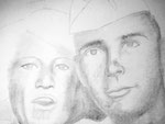
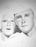
This step as compared to the last step is a good example of you mind telling you an area is dark when in actuallity it isn't. The area between the heads looked dark enough until you look at this step.
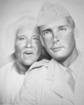
I'm satisfied with the level of darkness between the faces so now I'm going back over the faces with 5B pencil to darken up the shading.
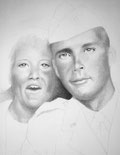
After applying the pencil, I went back over the roughed on graphite with the blending stump to blend it in. It looks like the darkness isn't quite as deep as what it was, which is due to the difussion after using the blending stump, but it is still good.
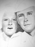
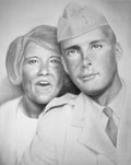
I've gone over the facial tones once again, trying to achieve the continuous tones between white (of the paper) and black (heaviest mark from an 8B pencil).
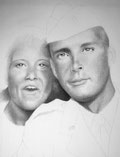
The facial tones are at a point that I feel I need to start working on the clothes and hair. Sometimes it can make a big difference once you fill in the hair and clothes at how much more attention you should give the face(s).
I basically follow the same steps that a did with the faces when adding the clothes/hair. I start with a general base tone overall and then using a blending stump, rough in the darker/shadow areas. Since the clothes to me are secondary, I don't put as much time and effort in them as the face(s). I pretty much use a blending stump only so there aren't any hard/crisp lines.
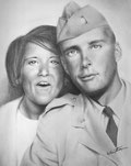
With the clothes and hair penciled in, and to a correct level of shading, I can tell that I still need a little more shading depth in the face(s). After applying more shading to the faces and bouncing between using the kneeded eraser, click eraser and blending stump tweeking here and there, I'm satisfied. At this point, if time allows, I set the picture up so I can view it from a distance and as I pass by it for a day or so. Doing this gives your eyes a chance to see things that you may not have noticed when working so closely on it.
Once I'm convinced that it's good, I sign it. As a personal note, once I sign my work, I don't allow myself to alter it any more.
Computer Illustration
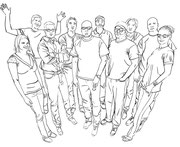
As a working Graphic Artist, I like to incorporate my artistic abilities into my work as often as possible. The following illustration is just such an example. I could have left the group photo that was taken as is, and no one would have thought differently.
Equipment and Software: Mac Pro (tower) Quad-Core processor, Wacom Intuos tablet, and Adobe CS5.5 Photoshop and Illustrator

Got the whole gang together and took a group photo. Brought photo into Adobe Photoshop and after adjusting Levels (color correcting), I proceeded to knockout the background. Didn't really know what I wanted to do with the image at this point other then to do something 'creative'. Also, two of the people in the photo (in front of me) left, so I had to remove them from the photo.
So, after some mental brain storming, I decided the best way to proceed (to delete the two individuals and 'be creative') was to give the whole picture a Graphic Novel look. I used Adobe Illustrator to create an outlined image of each person and give the over all image a warped perspective. The outlining of the faces proved a challenge keeping lines to a minimum, but yet achieving a good representation of each face. Felt good about the outcome - time to move to the next step.
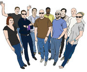
This step was just like coloring in a coloring book (and my Dad said it would amount to nothing). I tried to get a good medium hue (fancy word for color) for each specific area as later I would add shading and highlights to give more depth. The hardest part of this step was getting all the different colors of the blue jeans right.
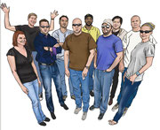
This is the big step. This step was done in Adobe Photoshop. Each color section, ie. - skin, shirt, pants, hair, was selected individually and after choosing my shading and highlight based on that particular color, I was ready to start. Each person took me on an average of a day to complete. Even though I thought I had my color palet correct, I found that I kept going back and adjusting the overall look (seems my skin tones were a little pale).
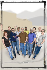
The finished piece. Added a loose, light and simple background to give a setting, but not compete for attention. Final printed piece was 24x36.